User interfaces
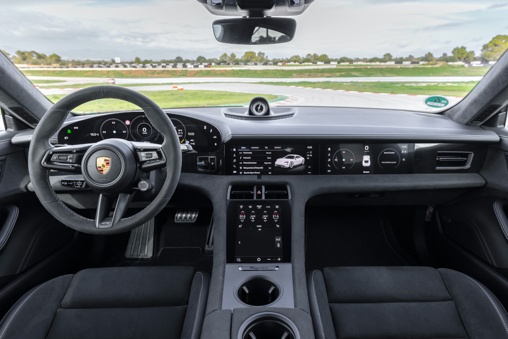
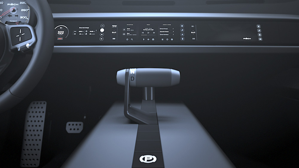
(Courtesy of Porsche)
Display on demand
Peter Donaldson explains the essential characteristics for an EV’s user interface to be accessible, effective and intuitive.
While governments’ plans to phase out IC-engined vehicles on short timelines is pushing individuals and companies towards EVs, they remain a small proportion of vehicles on the road globally. Most drivers will be new to EVs and will rely on the vehicles’ user interface (UI) to help them drive safely and efficiently. At the same time, the UI also provides vehicle OEMs with a powerful means of establishing and maintaining brand identity, while challenging engineers to balance that against more technical and pragmatic requirements.
Further, as cars become increasingly computing-intensive, the interactions their drivers and passengers have with them are inevitably brokered through software. While that applies to most vehicles, the rise of EVs has coincided with the central role played by smartphones, tablets and PCs in most areas of modern life, so it is natural that these technologies should influence how users interact with EVs.
“The automotive cockpit is increasingly being asked to deliver greater comfort, real-time communication, flawless connectivity, enhanced safety, ease of navigation and infotainment,” says an expert from an automotive user experience (UX) software provider.
“Drivers and passengers alike are looking for on-demand functionality, via apps, that is immediately accessible from any seat in the car through intuitive and user-friendly interfaces. In short, the cockpit is being transformed to have the look and feel – as well as the advanced features – of a smart device.”
More and bigger displays
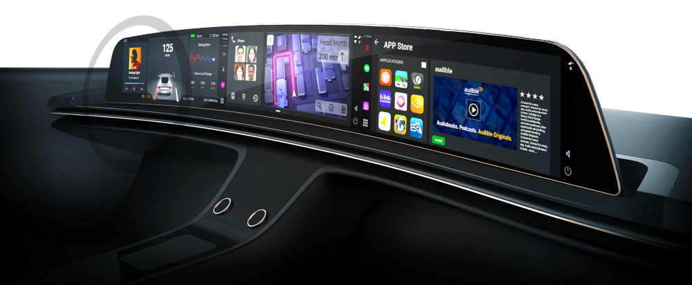
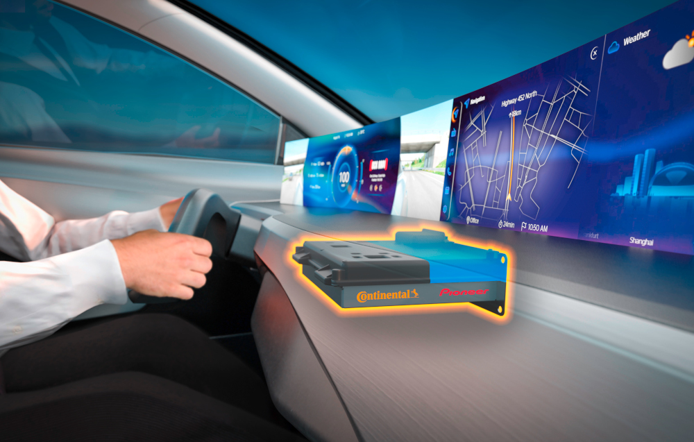
The UX software expert notes that the increase in size and number of displays is a major trend in EVs and vehicles in general, with the latest cockpits including more surface area dedicated to displays and controls than ever. Dashboard displays in particular are getting much larger, he adds, with some as long as 56 in and housing multiple display components under a single sheet of rare earth aluminium oxide glass, for example.
“Their beautiful appearance, subtle curves and sleek lines contribute to the car’s interior aesthetics, and they can be an important differentiating characteristic as consumers compare car models,” the expert says.
“Because plastic is perceived by consumers as lower-end, these displays are made of high-quality glass, with no seams and small, dark edges. Virtual reality capabilities, projected displays and 3D displays are also actively being developed and launched in luxury models.”
Furthermore, automotive engineers have never had so many options for presenting information to drivers and enabling them to give commands to a vehicle through a UI via physical, visual, acoustic and haptic channels, and even through combinations of these that are mutually supporting and provide redundancy.
A well-designed UI should give the driver all the information they need in a clear and timely manner, and enable them to select any function they want on the move and give them feedback that the right function has been selected without degrading their situational awareness.
Even with many years of experience with vehicle instrumentation, in-car entertainment systems and smart devices, however, getting that right remains a tall order; getting things wrong is easy, potentially leading to information overload, frustration and dangerous distraction. Deft application of disciplines such as ergonomics, aesthetics and psychology to the problem, as well as modern HMI design software, are therefore essential.
Adaptive interfaces
“A good UI needs to give the driver every necessary piece of information, but nothing that is not needed at that moment,” says the founder and CEO of a software company that offers an HMI development platform for the automotive and other industries.
“In modern cars, especially as they become more autonomous, the UI needs to adapt to the situation: in a very crowded city it is important to be informed about a car overtaking, or a cyclist or pedestrian in your blind spot, for example. Indicators in the UI that draw your attention to such information make sense. On other occasions the screen might be blank: if you are on a dark highway you just need to know your speed and you don’t need additional light that could distract you.”
From an aesthetic point of view, the HMI development software provider likes the design of the UI in the Porsche Taycan, and also praises that in the Tesla Model X.
“The one in the Tesla is straightforward, easy to understand and extremely accessible, and you don’t get confused by the number of submenus or irritated trying to find out where you are,” he says. “In some, when you find a menu you always have to remember how you got there and how to alter the settings. It was a very smart and very ‘reduced’ approach that Tesla took, and even though not much has changed in the past 10 years, I think it is still very up-to-date.”
(Courtesy of Visteon)
Range management
The principal HMI expert at a major automotive technology provider notes that, regardless of how a vehicle is powered, the UI must not overload the driver, while acknowledging the particular needs of EV users. He says the most important technologies in an interface designed for an EV are those centred on range management, emphasising that any EVs should have an intelligent route planner.
“Range management is an important factor from the end-user’s perspective, and it must work without much effort on the user’s part,” he notes. “That means the system independently determines the recharging strategy and supports the user with seamless route planning, including reliable navigation to charging points, and provides additional information, for example the range and the battery status display in percent.
“In addition, the HMI should implement strategies for introducing first-time users to the specific features of EVs, for example when they pick up a rental car.”
The HMI should walk the new user through every EV operational question, he adds, for example by providing information about the options for opening the charging flap and about the charging procedure in general.
People have a limited amount of attention to give to any task, so it is essential to ensure that a UI presents the information the driver needs and wants at the right time, without it being distracting.
While avoiding driver distraction is not specific to EVs, it always plays a major role in the development of the interface, the HMI expert notes, emphasising the importance of what he calls holistic HMI. That means the system recognises the user’s condition, knows the current driving situation and adjusts the information output in both content and modes accordingly.
“For this purpose, information is collected and presented quickly, in a focused and clear manner,” he says. “The flow of information is reduced, considering the driving situation and the driver’s condition. Only the information and options for action that are relevant in the current situation are offered.”
A holistic HMI also provides the driver with reliable feedback that they initiate, which builds confidence in the vehicle’s functions. In this context, he adds, it is also important that the HMI is as reduced as possible and adapted to the situation. Depending on the driver’s condition, the system should, for example, decide whether to switch on assistance systems.
Distraction, bad and good
The HMI development platform provider also values such minimalist approaches, enriched with additional information when it is needed. “Basically, when something important happens, the UI needs to distract you and must ask for your attention,” he says.
Because keeping the driver’s attention on the road is so important, it is vital to be able to measure the distraction that any particular aspect of the UI might cause. The most important sensors for doing so are in-cabin monitoring devices such as cameras.
“As a result, gaze and head movements as well as body position are analysed to determine the driver’s attentiveness,” the provider says. “Indirect measurement is also possible, for example via the duration and frequency of touchscreen operation.”
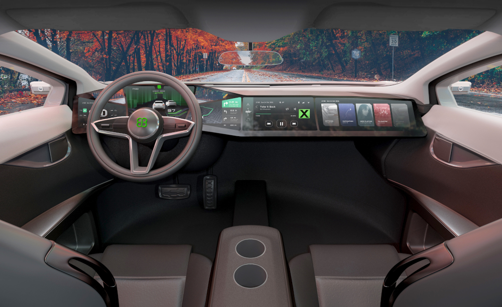
When the target of ‘distraction’ is a passenger in a taxi or an autonomous vehicle, the focus is on how to advertise goods and services to them without causing annoyance. The HMI development platform provider says his company is using a manual process to measure test subjects’ reactions.
(Courtesy of Elektrobit)
“Let’s say you arrive somewhere in an autonomous taxi; it could make offers of services at that location, such as a visit to a theatre for example. If you have just arrived from the airport and you get these questions you might be irritated and probably won’t accept any such offers, but if you are driving by that location and the car tells you, “If you look to the right you will see our famous theatre and I can book tickets for tomorrow,’ you are more likely to accept that offer.”
The company is thinking through what might be expected from cars in the future and how user interfaces can best provide prompts, and trying to figure out how to present the information, and how often. An advert could, for example, be shown full-screen and overwhelm the person because you want to push that offer, or it could just present a small indicator that the user can select to get more details.
“You probably don’t want to be annoyed by being shown new information every 2 minutes, and one or two adverts during the journey are probably enough, although perhaps you are fine with constantly receiving new offers,” the provider says. “These are the things we are trying to measure and figure out these things.”
Ergonomics and measurement
All of the above issues are problems addressed by ergonomics, the science that studies the interactions between humans and all kinds of engineered systems. As well as addressing physical aspects such as the comfort of seats and how easy (or otherwise) controls are to operate, it also encompasses mental workload under the discipline of cognitive ergonomics.
With the ubiquity of screens in vehicles and the multiplicity of ways of interacting with them using bezel buttons, track balls, touchscreens and so on, engineers need ways to measure their effectiveness.
One of the tools available for this is Fitts’ Law, which is used to model the act of pointing, either by physically touching something with a hand or finger or pointing to an object on a screen using a pointing device. Formulated by American psychologist Paul Fitts, the law says that the time required to rapidly move to a target area is a function of the ratio between the distance to the target and the target’s width.
The HMI expert confirms that Fitts’ Law is important in HMI development generally, with EVs being no exception. He explains that in order to make functions easier and safer to use according to Fitt’s Law, there are essentially two strategies.
“On the one hand, there is the option of temporarily enlarged buttons on the touchscreen,” he says. “In this case, the system recognises the approach of the user’s finger and automatically adjusts the button size in the landing area of the finger.
(Courtesy of Incari)
“On the other hand, the size and distance of buttons can be adjusted via configuration or personalisation options. For example, the user can choose to set minimal information features that includes fewer menu buttons on the display, which can be displayed larger.”
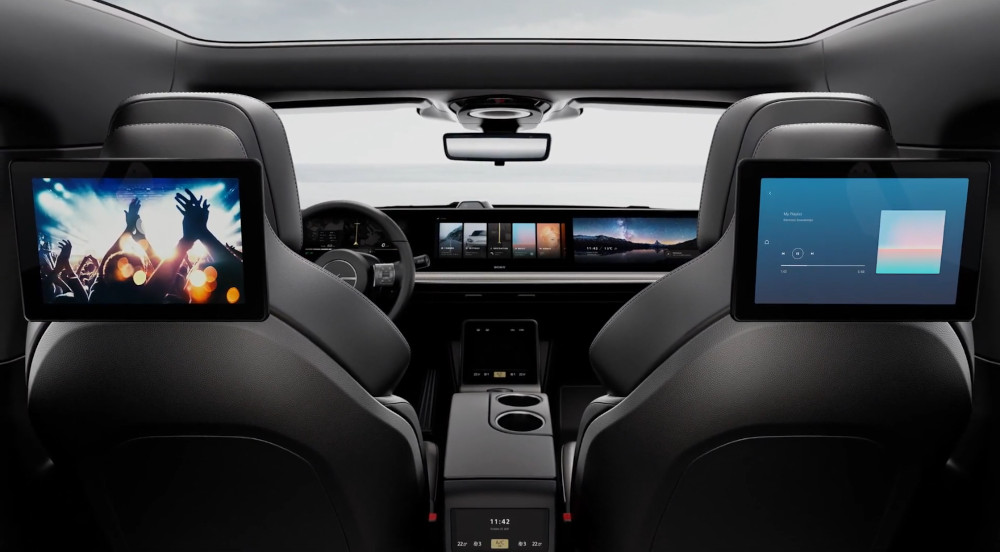
Modern interfaces also take passengers into account much more than they did before, so ergonomics as it relates to access to multiple systems from all seats is growing in importance, the UX software provider points out.
“As just one example, Sony’s Vision-S EV prototype includes a total of nine displays scattered across the driver’s seat, centre console, front passenger seats and rear passenger seats,” he says. “These displays, which are within easy reach of anyone in the car, allow customised access and control for infotainment systems, mirrors, HVAC components and other features.”
With many more options for interacting with the vehicle, getting the ergonomics right becomes far more complex.
Channel selection
While there are good rules of thumb for choosing the kinds of information to be conveyed through visual, acoustic and haptic channels, the optimum solution can be different as the driving situation changes, the HMI expert says.
Visual channels are agreed to be the best means of conveying primary data including speed and all space/location-related information such as the proximity of obstacles shown by parking aids for example, while the acoustic channel works well for navigation and warnings in combination with visual cues.
Haptics are good for immediate warnings and guidance, such as a vibration through the steering wheel to alert the driver to inadvertently wandering out of the lane for example. In this case, the haptic channel intuitively leads to the right response, the HMI expert says. However, none of these is necessarily the best option under all circumstances, so the interface must be adaptive.
“For example, if the system recognises that the user is making a hands-free call, the navigation system should not use the acoustic channel at that moment, as it is then often perceived as annoying, even if acoustic navigation announcements work best in other situations,” he says.
“Often a combination of channels works best, such as parallel visual and haptic output. The haptic sensory channel is an extremely good output method that the user perceives directly. However, this often has to be explained by another channel, telling the driver why the seat is vibrating, for instance.”
He says the visual channel can often become overloaded and should be supported by a holistic HMI solution. For example, the navigation system should work mainly acoustically and not require the driver to look at the screen.
HUDs and augmented reality
(Courtesy of Elektrobit)
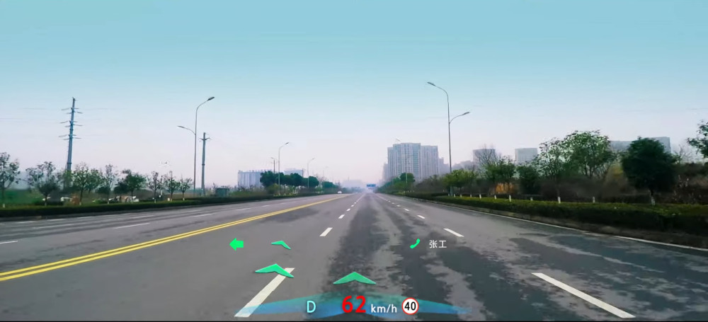
Heads-up displays (HUDs) came from aviation, and are finding their way into more cars as options or premium features, showing symbology focused at infinity in the driver’s line of sight so that there is no need to look away from the road.
The HMI expert notes that HUDs are best suited to showing manoeuvre and stabilisation information, including all primarily driving-related information such as speed, navigation, lane-keeping or distance-keeping instructions, as well as some EV-specific items.
“An augmented reality HUD can be used to show exactly how the vehicle has to be parked in order to be able to charge it, for example,” he says. “Another EV-specific use could be the display showing the range remaining. The combination of range indication and navigation, for example in the HUD, is one of the most relevant pieces of information for EVs.”
Our HMI development platform provider agrees, adding that speed and navigation guidance, in that order, are the top priority items for a HUD, and sees a lot of potential in augmented reality.
“I expect that we will see annotations on buildings, on post offices for example, street names so you don’t have to look at the signs, and even information about other cars in front and behind,” he says. “You might see above a car the speed it is travelling at. If you are coming up behind a car at 150 kph for example, and it is only doing 80 kph, the speed difference is additional information it makes sense to have.”
Where it starts to become very exciting is when a can receive information about hazards that the driver cannot see, he adds. “Say you are driving quickly in the Alps and there is an accident 5 metres around the next corner. A HUD can show you what’s happening beyond that corner and advise you to slow down.”
Input matters
When it comes to the driver making inputs to the HMI, there are important decisions to be made about which functions are best accessed via dedicated controls, and which through icons and menus on screens.
The HMI expert says that all safety-critical functions, such as hazard warning lights, must be operable via physical buttons. Furthermore, frequently used analogue infotainment functions should also be designed for physical operation.
“This includes, for example, the volume control, which works more intuitively and precisely using a classic rotary control,” he says. “The seat adjustment and window opening/closing work best with buttons as well.”
The HMI development platform provider believes that the best way to give commands to the car while driving is vocally, despite still encountering complaints about such systems. He argues though that voice recognition technology has improved enormously since it was first introduced into mainstream cars nearly 20 years ago. After giving up on the system in a Volkswagen Tiguan 15 years ago because it didn’t understand him, he says he tried again every few years when he got a new car, with positive results.
“Improvements in voice recognition are just breathtaking,” he says. “With Google Alexa and Apple Siri, most of the questions are understood even though they listening to all sorts of questions. In a car you can condense it down to a few relevant commands, and the driver can learn how to approach a car with the right syntax and so on, so it is much easier to implement.

“The mistake the industry made was to start rolling it out quickly at a time where the user experience wasn’t ready because the software wasn’t, and that is what a lot of people still have in their minds.”
The HMI expert notes that new noise reduction algorithms eliminate nearly all background noise, and even disturbing side conversations can be filtered out with new microphone systems, while the limited number of voice commands has been replaced by natural language understanding as used in voice assistants such as Alexa and Siri.
He cautions though that it is still a challenge to integrate voice assistant systems into the car and to network them with other vehicle systems. “For example, the voice assistant must be networked with functions such as climate control or the infotainment system to be able to control them accordingly,” he says
“And of course, the voice assistant system also must adapt to the particular driving situation in its dialogue with the user. To do that, the information from driver and vehicle monitoring must be made available to the system.”
He adds that it is also important that the dialogues become more intelligent and that the voice assistant interacts proactively.
For example, user: “Guide me to [address]”; system: “Your range is not sufficient. I will plan a coffee break at a charging station on your route.”
Intelligent systems can be even more proactive than that, for example by monitoring physiological cues given by the driver, such as frequent blinking that can indicate drowsiness and responding by recommending a break.
HMI philosophies
The introduction of all these ways and means of interacting with an HMI makes vehicle ergonomics a much more complex subject than ever, the HMI development platform provider argues, going far beyond how easy it is to reach the controls.
The technology has reached a point where vehicle OEMs and HMI developers have to consider different philosophies, such as those based on hierarchies of control methods and those characterised by very high levels of redundancy, and even mixtures of the two.
A hierarchical control philosophy might have the driver activate the climate control, for example, with a voice command and then set the temperature with a physical button or knob. Alternatively, the driver might activate it with the push of a button and then use a voice command to set the temperature.
(Courtesy of Continental)
That, however, would not work well for people with some types of disability, so making the vehicle accessible to them would likely involve providing multiple ways of using every function in the HMI, the expert points out.
“If I were unable to speak, for example, I might need buttons to control everything I want to use, but if I were missing limbs I might need speech recognition to execute everything the car can do, and there would then be a huge amount of redundancy,” he says.
“It is not clear yet what the standard in cars will be, but it can’t remain like this where everybody does something different,” he adds. “The industry has to align what we understand about ergonomics and how it should be interpreted, and then I think we will get more standardisation.”
Roles for AI
AI will play an important part in EV interfaces, the HMI expert says, especially in range management and in building trust. “Reliable range calculation increases user trust, which is an important enabler for EVs. Range calculation algorithms are adaptive and based on learning systems that draw on cloud-based information.”
For that, he says, connecting the vehicle with the infrastructure is extremely important. “The range calculator needs to know where there are charging stations that are working and not currently occupied,” he says. “That, in conjunction with cloud-based services such as booking and payment, will become a significant trend.”
The UX software provider expects AI to be incorporated into advanced technologies that track EV drivers’ eye movements, recognise and accommodate different drivers, identify changes in emotions or expressions, and respond appropriately. “If a driver seems inattentive, for example, AI-enabled sensors might send an alert or trigger Level 4 or Level 5 autonomous driving functionality,” he says.
As well as assisting drivers and other occupants through the vehicle interface, AI is also expected to help engineers design new interfaces, the HMI development platform provider says. “We expect to have AI help the designer, who comes up with smart proposals for what the UI should look like and how it should function before building up all the details,” he says.
So the designer can have the big idea of the interface’s overall look and philosophy – perhaps one that is minimalist or, in contrast, overwhelming, for example – and decide on some of the functionalities it should have.
(Courtesy of Continental)
“The AI can then start to build up the executions you need behind these functionalities, so AI can write the software code for a proposed interface’s functions,” the provider says. “That reduces the workload for developers, who can then focus on new ideas. Here, AI can assist a lot, where you give direction and it basically builds up the functionalities in the background.”
He describes his company’s HMI development platform as a set of tools that helps designers and engineers to create interfaces easily, and with functional implementation of software code that can control the motors and sensors in the car.
“It allows you to implement the complex, futuristic interfaces with highly dynamic graphics very quickly, not just as a concept but as a working product,” he explains.
“All car makers are grappling with the complexities of bringing together the software, hardware, electronics, interfaces and controls, graphics and other elements necessary for these advanced systems,” the UX software expert says. “It can be extremely difficult for automakers to assemble all the diverse expertise needed to optimise the entire cockpit environment.”
With EVs in particular, he adds, manufacturers need to make the right multidisciplinary trade-offs, such as performance versus power consumption, and make choices that are good for the system as a whole.
“While aesthetics and infotainment features are critical, the cockpit must also be carefully engineered to deliver robust performance under real-world operating conditions,” he says.
Acknowledgements
The author would like to thank Osman Dumbuya at Incari HMI Development Platform, Guido Meier-Arendt at Continental, and experts at Elektrobit for their help with researching this article.
Swedish study
“Driver Interfaces for Electric Vehicles”, by Helena Stromberg and MariAnne Karlsson at Chalmers University, Goteborg, and Pontus Andersson, Susanne Almgren, Johan Ericsson and Arne Nabo, at Saab Automobile.
Early EV HMI research
In 2011, a team of researchers from Swedish industry and academia conducted a simulator-based study of two UI designs for an electric car – a conventional one that closely resembled that of a petrol-engined car, the other more innovative and based on feedback from drivers who had used the first.
In both cases the interfaces consisted only of the instrument cluster. Each showed basic information, while the second included the option to expand some of the display items with the aim of improving drivers’ understanding of EV systems.
The traditional human-machine interface HMI presented three dials, the largest being the speedometer. This was semicircular, with a needle and a rectangular strip at the bottom showing the drive selector position, and digital displays of temperature and odometer data.
To the left of the speedometer was a circular distance-to-empty gauge with a needle and a small silhouette of a car with a double-ended arrow underneath it, both in green, to indicate that the car was ready to drive.
To the right of the speedometer was the so-called ecometer, a circular gauge containing three pointer needles with their pivot points arranged in a triangle. The needle at the triangle’s apex was labelled ‘Ecometer’ and pointed to a green sector flanked by red sectors left and right to indicate how much charge was being taken from or put into the battery.
Labelled ‘A’ for auxiliary, in reference to non-propulsion loads on the battery, the needle on the left pointed to tapering green segments that narrowed to indicate that the use of onboard equipment was making the drive less ‘green’. Finally, the needle on the right pointed to SoC markings for the battery, supplemented by two laptop-style battery icons, the first indicating the charge level and the second lighting up yellow when the SoC reached 15%.
The team found that some driver shad problems understanding the EV-specific information content for EVs in both interfaces. One problem with the traditional interface was that it led participants to expect the vehicle to behave as though it had an IC engine, while the innovative one could induce feelings of insecurity. More basically, they attributed some of the problems to participants’ lack of knowledge and useful mental concepts of electricity and batteries.
Although the Swedish study is now more than 10 years old, it would be unsurprising to find that the same core problems are still encountered.
Some suppliers of user interface systems
France
Valeo
Germany
Bosch
Continental
Elektrobit
Incari
Japan
Alpine Electronics
Denso Corporation
Panasonic Corporation
USA
Harman
Incari
Visteon Corporation
–
+331 405 2020
–
+344 892 0115
+495 119 3801
+499 131 77010
+493 069 535730
–
+345 313 1660
+888 800 9629
+344 844 3899
–
+1 203 328 3500
–
+1 734 627 7384
ONLINE PARTNERS


